
If you’ve ever gazed at the night sky and wondered if maybe we are not alone, or binge-watched episodes of The Secret of Skinwalker Ranch, then this article is for you. By the way, I highly recommend The Secret of Skinwalker Ranch, though it may not be for everyone. Dr. Travis Taylor is brilliant on the show, using physics to explain some of the wild phenomena. He reminds me of a real-life MacGyver!
I’ve always been fascinated by anything related to space or aliens, and I read up on any new discoveries in these areas. The kid in me can’t help but get excited whenever I encounter a new mystery. So, when I was brainstorming a fun way to dive into data storytelling, I decided to explore reports on notable unidentified flying objects (UFOs) sightings
Before we dive into the project, let’s talk about the essential ingredients for telling a great data story.
- Highlight Key Discoveries: Just like books highlight the key moral or lesson learned from the story, your data should immediately highlight what you’ve discovered from analyzing it.
- Identify Trends and Patterns: Don’t just throw data at people like confetti at a wedding. Instead, help them see the patterns and context around the data, so they can understand the bigger picture.
- Enable Deeper Exploration: An insightful data story should let the audience dive deeper into specific data points or segments, giving them the chance to explore the details that matter most.
The Project
For this project, I developed a dashboard in Power BI (Business Intelligence). For anyone new to this field, Power BI is a business analytics tool from Microsoft that helps users visualize and share insights from their data. It allows you to create interactive reports and dashboards, pulling data from various sources (such as Excel, databases, and online services).
The data I used was from the National UFO Reporting Center (NUFORC), a private, non-profit organization that collects and publishes reports of UFOs from around the world. Founded in 1974 by Robert J. Gribble, it serves as a central hub for individuals who witness strange aerial phenomena and wish to report their experiences.
The dataset includes the following key fields:
• Datetime: The date and time when the UFO sighting was reported.
• City: The location of the sighting.
• State/Province: The region where the sighting occurred.
• Country: The country where the sighting was reported.
• Shape: The reported shape of the UFO (e.g., circle, light, sphere, etc.).
• Summary: A brief description of the sighting.
• Report Date: The date the report was filed.
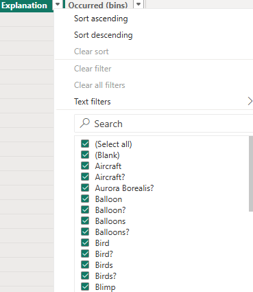
• Explanation: The possible explanation for the sighting (e.g., drone, satellite, planet/star).
Data was pulled based on Datetime Jan 2020 to Jan 2025.
Building the Data Story
Step 1: Exploratory Data Analysis (EDA)
Before jumping into data storytelling, it’s crucial to perform Exploratory Data Analysis (EDA). EDA helps you determine whether the data is complete and if there’s enough content to actually tell a story. This involves checking counts, identifying any null values, and spotting odd data points—like future dates (spoiler: they’re probably not coming from a time traveler, although I wish that were possible!). It’s essential to thoroughly check the data to ensure it’s reliable enough to build your story upon.
My experience reviewing the data indicated that it appeared to have complete information based on the available data points. One challenge was that the city or state wasn’t always populated; however, the country was always present. Out of the 25,700 data points, 44 were missing the state, which is a very small percentage.

The other issue identified was that the Explanation field contained duplicate values due to the presence of ‘?’ or ‘-‘. Some cleanup would be needed to group these values together.
Step 2: Data Cleanup and Creating Calculated Columns
To clean up the data, I created a calculated column using DAX in Power BI. DAX (Data Analysis Expressions) is a powerful formula language used in Microsoft Power BI, which helps you build calculated columns, measures, and more. I chose to remove unwanted characters and concatenated the city, state and country.
Location =
VAR CleanCity = IF(TRIM([City]) = "-" || TRIM([City]) = "0" || ISBLANK([City]), "Unknown City", [City])
VAR CleanState = IF(TRIM([State]) = "-" || TRIM([State]) = "0" || ISBLANK([State]), "Unknown State", [State])
VAR CleanCountry = IF(TRIM([Country]) = "-" || TRIM([Country]) = "0" || ISBLANK([Country]), "Unknown Country", [Country])

RETURN CONCATENATE(CleanCity & ", " & CleanState & ", ", CleanCountry)
Similarly, the Explanation field required some cleanup, and I used the SUBSTITUTE function in DAX
CleanedExplanation =
VAR CleanedText =
    SUBSTITUTE(
        SUBSTITUTE(
            SUBSTITUTE(
                SUBSTITUTE(
                    TRIM([Explanation]),
                    "-", " "),      // Replace "-" with a space
                "(", " "),       // Replace "(" with a space
            "?", ""),           // Remove "?"
        "  ", " ")               // Replace double spaces with a single space
RETURN CleanedText
Step 3: Discovering Patterns
The final step is where the fun begins. Identifying trends in the data is key to uncovering interesting insights. Based on the attributes of the dataset, here are some ideas for what you can explore:
- UFO Sightings Over Time: Track trends in UFO sightings over time. Are there specific months or years with a spike in reports? Perhaps there’s a seasonal pattern (e.g., more sightings in the summer, or maybe it’s just that people are more likely to spot UFOs after a vacation?).
- Popular Locations: Which cities or states have the most frequent UFO sightings? You can use this information to create a map or bar graph to illustrate geographic hotspots—because if there’s a UFO sighting hotspot, you might want to pack your bags (or stay far, far away. I guess it depends on the day!).
- UFO Shapes: What are the most commonly reported UFO shapes? Do certain shapes appear more frequently in specific locations or at particular times of the year?
- Common Explanations and Words Used: What explanations are most commonly associated with sightings (e.g., drones, satellites, weather balloons)? You could present this as a bar graph to help everyone quickly see which theory carries the most weight—or at least, the most air time. You could also use a word cloud to display the summaries and see if any specific words stand out!
Step 4: Building out the visuals
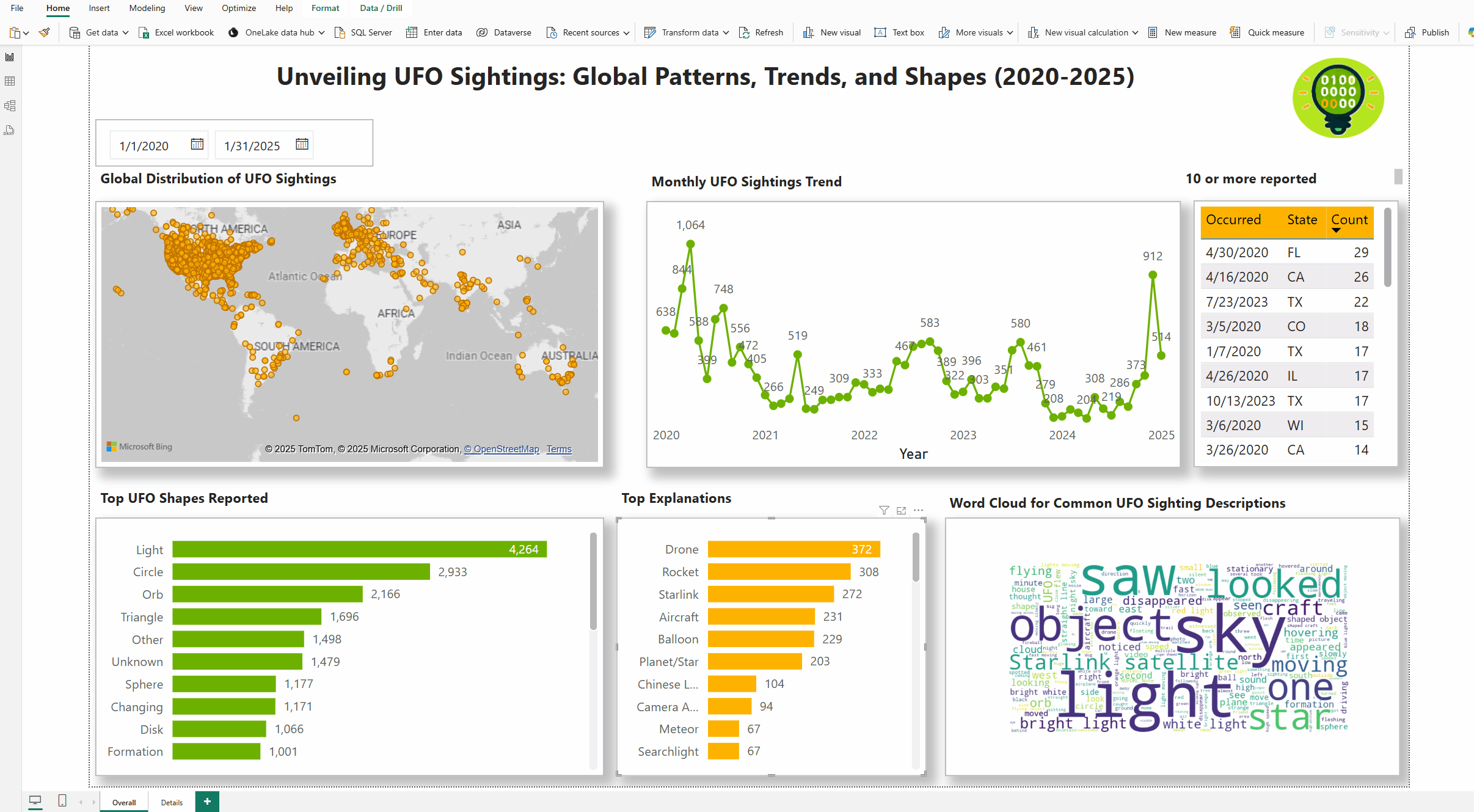
Click here for the larger view of the dashboard
To build out the final story, I used six visuals:
- A map visual to show the location of the UFO encounters.
- A line chart to show the trend over time.
- A table to display the top 10 or more occurrences.
- A bar graph to visualize the most common shapes identified for the UFOs.
- A bar graph to show the common explanations noted.
- A word cloud to visualize the top words from the summary of the experience.
With the exception of the word cloud, the other visuals are standard features available in Power BI. The Word cloud is available in the market place as a custom visual, however, you can only download it if you have a work or school email address. For the word cloud, I created a custom visual using Python.
Here are some pre-work steps you need to follow before using Python in Power BI:
- Enable Python scripting: You’ll need to enable Python scripting in Power BI. If you haven’t installed Python yet, go ahead and install it. After that, set the Python executable path by going to File > Options and settings > Options. Under the Global section, select Python scripting.
- Install necessary libraries: You’ll need the following libraries for this task:
pandaswordcloudmatplotlib
- Add the Python visual: In Power BI, go to the Visualizations pane and click on the Python icon (you may need to install the Python visual if you haven’t already). Then, drag and drop the Summary field into the Values field well of the Python visual.
- Python code to generate the word cloud: Use the following Python code to create the word cloud:
# Import relevant libraries
import pandas as pd
from wordcloud import WordCloud
import matplotlib.pyplot as plt

# Get the dataset from Power BI
data = dataset['Summary']  # Adjust to your column name (e.g., 'Explanation')

# Combine all the text data into one long string
text = " ".join(str(summary) for summary in data)

# Create the word cloud
wordcloud = WordCloud(width=800, height=400, background_color="white").generate(text)

# Plot the word cloud
plt.figure(figsize=(10, 5))
plt.imshow(wordcloud, interpolation='bilinear')
plt.axis("off")
plt.show()
To provide deeper insights and allow for further exploration, I created a drill-down report as well.

Takeaway
Good data storytelling not only presents numbers but highlights key insights, trends, and patterns that transform raw data into a story worth listening to. Take UFO sightings, for instance. By analyzing the trends over time, popular locations, and even the wacky shapes of UFOs, you can uncover some intriguing insights that might make you question whether we’re truly alone in the universe.
Using visualizations, like maps, line charts, and bar graphs, helps engage the audience and makes complex data easier to digest.
Interactive dashboards, like those created with Power BI, allow users to drill down into the data for a closer look. This feature enhances the user experience by enabling deeper insights into specific data points and trends.
